
2011 NBA Draft Style Analysis: The Suits Finally Fit and Kemba is King

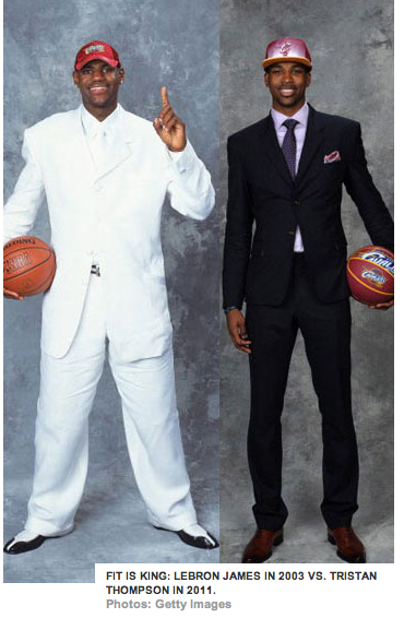


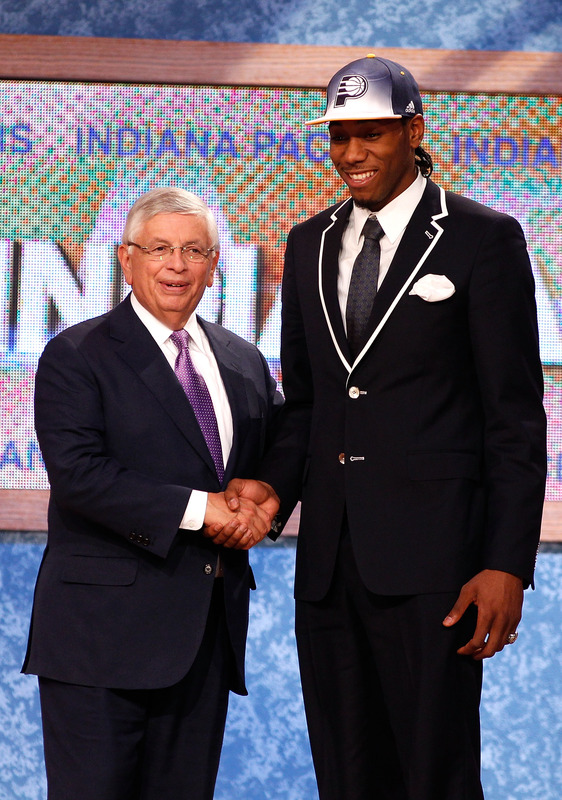
The 2011 installment of the NBA Draft was not given the opportunity to be great. Madison Square Garden, the usual host for festivities, is under renovation so the hopeful rookies had to travel across the Hudson River to Newark and walk the stage at Prudential Center. Bloggers and basketball pundits dismissed the next class of NBA talent as bottom tier. Also, with a lockout looming - will these young men ever see playing time? In 2003, LeBron James' oversized white ensemble was better suited for a pimp and not the first overall draft pick. His personal style has evolved thanks in part to the dress code, maturity and careful image management. The NBA instituted the dress code in 2005 and it came at the perfect time as menswear was moving towards to the skinny suit and tailored styles thanks to Hedi Slimane at Dior Homme. Fitted or "European" styles began dominating locker rooms along with luxury sneakers and Louis Vuitton everything. Braids began disappearing as Carmelo Anthony shaved his off and Kobe Bryant switched from jerseys pre-game to suits. Players no longer wanted to look like Allen Iverson but now Kanye West's fashion forward style evolution was to be mimicked. This year's draft class may not have hit the perfect style notes but it's clear that with the help of stylists, the new kids are learning how important fit is in a suit. Gone are the days of the LeBron white suit or Jalen Rose's infamous red atrocity. Without further ado, here's the best, worst and downright average style grades for the 2011 NBA draft class. It should come as no surprise that a New York kid wins my award for best dressed. Kemba Walker won my respect and fashion gold star last night because he wore a suit that was not only perfectly cut for his body type but because he was able to still let his personal style shine through. Last year, Wesley Johnson's plaid pants and double-breasted ensemble may have been sartorially inclined but it looked like the outfit wore him, not the other way around. Walker looked both comfortable and cool in the single breasted blue-grey suit. The peaked lapels were in proportion with his shoulders and the jacket was modern without being fussy. Walker was already on my radar for his understated, well-fitting suit at Connecticut's visit with President Obama after winning the NCAA National Championship. His big heart and great speaking skills makes him a complete player off the court as well - he's a marketing dream. In fact, he already has endorsement deals in place with Axe and Best Buy without the elusive title of being the number one draft pick. Walker's accessory choices elevated his look from above average to exquisite. The pocket square in beige with a pink hue picked up the rose gold outsole of his two-tone shoes. The tie bar kept his look clean but added some visual interest on his thin, patterned tie. Even his belt was a leather with a pink undertone to tie it all together. Fellas, when I say the items of your outfit don't have to match but they have to go, I'm talking about putting an ensemble together like Walker's. The hues (underlying color) are all in the same family - blue in the primary items and pink in the accessories. Since the colors are all related, they work in harmony. I'm excited to see what Walker brings to Charlotte off the court. According to my favorite Bobcats' source, Ben Swanson (a.k.a. CardboardGerald), the rookie came to the press conference dressed to impress in Louis Vuitton sneakers. Kemba Walker, you're on my fashion radar. He's my early pick for style rookie for the season....if we get a season.

Walker's swag dominated the night but credit has to be given both to my Canadian countryman Tristan Thompson, as well as Marshon Brooks for sporting full ensembles not just a suit. Thompson (and his personal shopper) found a suit that managed to fit him perfectly without looking snug in the shoulders or short in the sleeves - an issue for a player with a seven feet, two-inch wingspan.The polka dot tie contrasts with the pink tone in the shirt and the paisley pocket square ties it all together.His rose gold watch face is the right shade for his skin tone and the leather watch strap and shoes are the perfect complimentary shade of warm saddle brown - this is how to wear black and brown together. It certainly looked like Thompson dressed to best match his new Cavaliers cap - think he knew something the media didn't?
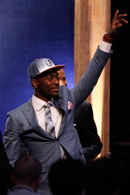
In every draft class, there seems to be one player that calls dibs on the bow tie and tries to make it work for him. This year, Marshon Brooks took the honor. The last time a bow tie was worn properly was when James Harden sported his cream ensemble and has since had the neck accessory a signature. Brooks seems to be following Harden's sartorial example. Brooks was originally drafted by the Celtics before being moved to the Nets, sported another bow tie at his introductory press conference in Newark. For draft night, his two piece grey suit fit in the shoulders and the sleeve length was fine although it could be taken in more in the torso and in arm width to remove some of the bulk - the ill fit was made obvious when he stood up to meet Commissioner Stern. Besides the technical suiting issues, the patterned shirt mixed with the neutral grey suit really make the bow tie the star to the outfit. A good tactic to draw attention up to Brooks' face and away from the terrible adidas draft caps.

The number one pick in the 2011 NBA Draft was Kyrie Irving out of Duke University and the only thing that streamed first overall about his outfit was his timepiece.Besides the impressive watch, the rest of ensemble was average - decent fitting jacket and shirt, pants could be tailored and the tie was too skinny and poorly knotted. Hopefully fellow rookie Tristan Thompson and veteran NBA fashion plate Baron Davis can help their new teammate take some risks this season.
Speaking of sartorial risks, Kawhi Leonard went for preppy throwback look with white piping on black two button suit. When I originally saw this suit, I immediately thought he belonged on a yacht or perhaps parking cars at the yacht club. The buttons are a bit distracting and the pocket square seems like an afterthought but the piping has grown on me. Keeping the shirt and tie relatively neutral was a smart move so it didn't distract from the jacket. The fit is decent, but as with many of these young men, the sleeve could be slimmed down. A pop of color or sheen in the pocket square could have upgraded the look and he might want to re-think the braids - no one should take manscaping cues from Udonis Haslem.

Pocket squares have become the new accessory of choice for NBA draftees in recent years and this year, some players either didn't put enough thought into them (Leonard) or tried too damn hard. It's important to remember that for these young men, most of their interviews will head and shoulder shots so the pocket square will be shown and having one that looks like a used tissue stuffed in your pocket looks sloppy. The Morris brothers were a great story of the draft, twins going one right after another to different cities for the first time in their young lives. But they had me crying foul all over Twitter as with the pocket square, bigger is not necessarily better as you have a limited space to display your accessory.
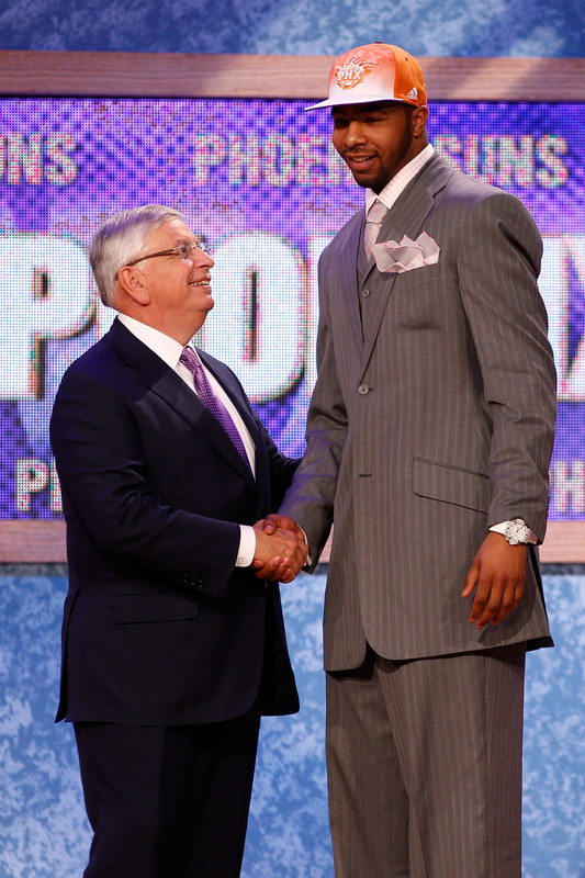
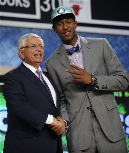
Markieff Morris, the slightly older twin and the first to be drafted, thirteenth overall to the Suns, wore a pinstripe suite that looked be right off the rack and ill-fitting on his massive frame. The jacket is too long, the shoulder are bunching and sleeves and pants must be taken in. Also, on a large man a three-piece suit adds bulk, he should have gone for a sleeker silhouette. As for the pocket square, it looks like he found some iridescent Kleenex and stuffed it in his pocket. The fact that you actually see a bulge from the access fabric in the jacket is a terrible look. Remember, it's a square, not a scarf. While we're on accessories, white watches, like white sunglasses, often just look cheap and it does not work with his outfit at all.

Marcus Morris, the younger brother by seven minutes, was drafted next to another Western Conference team, the Houston Rockets. Marcus, followed suit almost literally with a pinstripe three-piece suit in black that was looked to fit in the shoulders but not so well elsewhere. Not to be outdone by his brother, upped the pocket square ante as his almost reached his tie knot - far too large. I'm all for flair but the pocket square took over his entire outfit and you became distracted by his accessory and not listen to what the newly minted rookie had to say. Also, if you look the Morris' brothers wore similar shirt and ties. The best moment from the twin's draft came from their interview with their mother, who was also in a pinstripe suit, who said she wouldn't wear either of the adidas draft caps - smart woman.

As for the rest of the draft class, it was nice to see the players put some effort into their attire, the recent explosion of athlete stylists are certainly helping keep the players current. Derrick Williams tried to work with a skinny suit silhouette but didn't make it. The tailoring was fine but the tie knot didn't work with the shirt or the tie width. The bright red tie was a nice burst of color, but some more texture would have really made Williams stand out.
Jimmer Fredette came into the draft with plenty of hype thanks to his ridiculous NCAA campaign. While Fredette's stock dropped a touch on concerns over lack of defensive fundamentals and size, his fashion game could probably use a return to basics. His jacket hit in the wrong spot and Fredette looked like he was sporting a pot belly. The stance on his jacket was a touch high and the cut made him look boxier. Dressing in BYU blue (navy suit, blue tie, blue shirt, blue watch) was a nice nod to his alumna matter but it came off a little dull. Fredette is more modest than most NBA rookies but his giant timepiece and rapping brother give the impression that the young man from upstate New York wants to take a few more risks.
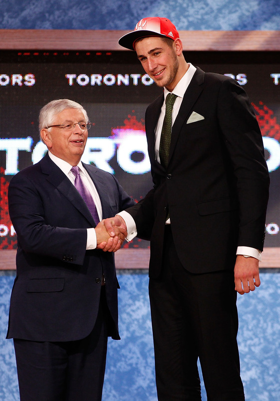
Finally, I have to give points to Jonas Valanciunas, my hometown Toronto Raptors fifth overall draft pick. Most Raptors picks were hoping that local hero Tristan Thompson would have his homecoming on the Air Canada Centre court, but as usual the Raptors went European. Valanciunas went for subtle but well-tailored. The olive-green tie and pattern mixing with a different pocket square elevated the look from basic to interesting. The sleeve length was also on point so kudos to the unknown centre. I'm sure he'll be a frequent visitor to Yorkville this season, Toronto's high-end shopping neighbourhood soon.
Overall, this year's draft class was an improvement over last year's. The new crop of NBA rookies need to continue to practice and perfect the art of fit and how to dress their frames. Hopefully they'll start taking more risks and find their own personal style among the NBA trends and Louis Vuitton littered locker rooms. Good luck gentlemen and welcome to the big leagues.
Photos courtesy of ESPN.com,Yahoo Sports and NBA.com.
James Harden: Most Fashionable Man-Child
James Harden is only twenty-one, just old enough to buy alcohol legally in the United States. Harden is proving his worth for the Thunder these playoffs, averaging eleven points a game and shooting almost forty-one percent from the field. Harden is providing a spark for his teammates off the bench, but NBA fans are more enamoured with his unique manscaping and style. The member of the Thunders' Broingtons always stands outs among the usual NBA off-court uniform of dark, ill-fitting suits or head to toe Gucci ensembles. For the post-season, the Los Angeles native kept his full beard and shaved his hair into a mini mohawk. The hairstyle speaks to Harden's quirky California personal style and boyish charm.

When the Oklahoma City Thunder came to Toronto earlier in the season, I chatted with the sophomore shooting guard about his infamous beard and personal style. The beard discussion was posted on The Basketball Jones but Harden and I got to talking fashion and sneakers, too.

Harden defines his style as very LA, which to him means "flannels, little t-shirts, [Nike] Dunks, varsity jackets, stuff like that". While being a LA native, the west coast kid doesn't think he has a specific personal style code. If he sees some nice clothes, he buys them - one of the luxuries of having an NBA salary. "I wear a lot of [Nike] Dunk's, cartoon shirts, varsity jackets". Harden's love of cartoon shirts is something that's caught my eye since he was in college. It's not a look that's very popular on the east coast but for Harden, the cartoon shirts started because it's all about the shoes, "I get shirts to match my dunks. They got a store [in LA] called Hot Topic and they have a lot of cartoon shirts there..it's just about being from LA".

Harden's other style signature is the bow tie. It started at the NBA Draft with Harden's statement making outfit.. He wore a cream colored vest, pants, a striped shirt, a tan sport coat, a diamond encrusted watch and a burgundy patterned bow tie. While it was a lot of look, Harden just wanted to wear something different, "I don't think I thought about it...With the bow tie, I have a lot of them now....it's different, unique [my style] just comes natural, not something I try to do." Since the night he joined the Thunder, Harden's racked up over ten bow ties and plans on getting a lot more as he buys more suits.

Harden will be buying more suits mostly due to the NBA dress code. While most players are able to bring their own flare to their outfits despite Commissioner Stern's rules, Harden admits most of his wardrobe goes unworn on game days. "I [usually] wear a lot of hats, t-shirts, that I can't wear...The rules are put in place for a reason, but I still try to work around it". The shooting guard may think his style is the best in the league, but he'd still jump at the chance to raid a few wardrobes. "[I'd like to see what] top guys like Kobe and Lebron got in their closet, they probably got tons of stuff in their closet, I just to see what their wardrobe looks like."

Harden's personal style extends to his shoes, too. He can't pick a favorite pair but his choice Nike model will always be the Dunk. He's looking at adding the Gucci inspired pair to his collection and also loves the Canal Street Air Force One's because they're "cool and bright". Harden's style advice for those who want to follow his lead is to experiment with colors and not focus on one style, "anything you see that's unique and different, try to pick it up." Harden's hair is evidence that he practices what he preaches and allows him to bring his style on the court too. I wouldn't suggest the mohawk and beard combo unless you're around Harden's age or can grow a significant beard like him.

Leave the Classics Alone: Tommy Hilfiger's Uniform Re-Designs for ESPN the Mag
Every year when the ESPN Style Issue drops, I feel like a kid at Christmas. How will the worldwide leader in sports cover the niche of aesthetics and athletics in print and online? I approach this issue with a critical eye: partly because I hope to edit it myself in the near future and because I hold the subject very close to my heart and my wardrobe. Naturally, this year's style issue features a column on uniforms, the organized sports version of the runway show. The uniform in gameplay are much like the garments in a runway show. They are classic and minimally styled but punched up with talent - like the Yankees big sluggers or a Calvin Klein show with super models walking. Or, they are outlandish or seemingly impractical like a Hussein Chalayan's robot dresses or the Oregon Ducks infamous technologic gear. Is it wearable, practical and most importantly, will it sell? After all, both sports and fashion are businesses.

For this Style issue, ESPN had Tommy Hilfiger, the iconic Americana designer, re-interpret four classic uniforms - the New York Yankees, the Montreal Canadiens, the Dallas Cowboys, and the Los Angeles Lakers. It was an interesting yet obvious choice to have a heritage designer put his own spin on four uniforms that haven't changed much from their original but beloved classic gear. I would have preferred to have Hilfiger take a crack on the teams that really need help in finding their own identity in their brand and style. The Oklahoma City Thunder, the Jacksonville Jaguars, Arizona Diamondbacks and the Phoenix Coyotes are among many teams that could all use a professional's touch in the design department.
It would need a total brand overall and a lot of space, styling and graphic design in the magazine. However, using North American's most popular teams as an example are a way to drive page views, debates and sheer terror in the hearts of fans and jersey aficionados alike.

Out of all the designs by Hilfiger, I feel that the New York Yankees' uniforms were the most disappointing. I'm a Mets fan, but even though my green-eyed MLB monster may look to the Yankees' roster with envy, I'll always admired their pinstripes. There was uproar when names were to be added to the player's shirts - you don't mess with the classics and a certified money-maker. Hilfiger was smart enough to stick to pinstripes at least, the root of the Yankees style. However, using constrasting colours on the back and front of the uniforms was a mistake. Two different pinstripes at the same time would be dizzying to the cameras as would the use of both white and blue as it would be tough for the cameras to focus on the bright white as it would glow in the outdoor sunlight and under the stadium lights and balance it with the deep navy. Not only would it look poor on broadcast but it would be difficult to wear for thicker players to wear. Can you imagine a big man like C.C. Sabbathia half in navy and half in white - colour blocking with stripes would not have a slimming effect on the hefty pitcher.
The "NY" in the Tommy Hilfiger crest looks more like the New York Jets logo than the slim Yankees logo. It's been imitated, tattooed and emblazoned on millions of ball caps - but it's never bested. You can't mess with that classic logo. The font of the numbers is fine and reminiscent of the original font the Yankees use now, however the placement on the chest looks too low and with the Hilfiger crest on the opposite chest, it puts so much emphasis on the top half. The use of button and polo collar are not practical for baseball. A big part of speedy Yankees like Curtis Granderson, is the ability to steal bases and sliding on all those buttons isn't safe - they could chafe or open while in play. I like the pants as they're simple and the socks with vertical stripes are very classic. However, all the pinstripes and colour blocking just muddies up a usual clean jersey.

The Los Angeles Lakers' current gold and purple home jerseys haven't changed much since their move to the city of Angeles from Minneapolis. The shorts are longer, the font is crisper and the material is more advanced but the classic, retro style remains. Hilfiger says his inspiration comes from sailing motifs in his own collections however I'm not sure why players would want to look like a sail. The purple and white stripes are somewhat awkward across the chest, widening that area and not lengthening players, which would be more aesthetically pleasing. The beautiful Lakers front was replaced with a boring, basic font that would look better on a typewriter and not a jersey. It's very small and white, which would be difficult to read on the bright yellow on camera and in the arena.
I'm glad that Hilfiger used his better judgement against the short-shorts and keeping a long, loose silhouette that the players prefer. Especially after the recent "Fab Five" documentary, where the long shorts were championed with style and swagger. The stripes on one leg of the shorts is visually interesting and echos the horizontal stripes on the jerseys but once again, makes them seem larger. Perhaps if they were on both shorts or on a diagonal layout it would be more flattering. I don't mind the number on the shorts, however it shouldn't be bigger than the number on the front of the jersey, it should be smaller or equal in size. The crest on the front of the jersey looks tacked on and that's where the NBA embroidery is meant to go. It would look better scaled down and on the back of the right leg of the shorts.

The Cowboys, partly due to owner Jerry Jones' constant chatter, are "America's team". They're the second most valuable sports franchise according to Forbes, only Manchester United bests the blue and silver. I find the Cowboys uniform to be the most aesthetically pleasing of the four re-designs as it is somewhat loyal to the original version. However, the uniforms are overly embellished. The concept of having the infamous Dallas stars all over the sleeves to represent all the different states that the players come from is a sweet idea and a tribute to the team, however it fails in execution. The sleeves look cluttered and like they belong to perhaps a pewee team - at least the Ohio State Buckeyes keep their small stickers on their helmet, not on their apparel. It would be better to keep the Stars minimal for more impact, like the giant Star on the centre of the Dallas Cowboys New Stadium. The small star and simple lines on the pants are a nice, clean look. I like the idea of the American red, white and blue stripes around the middle but it would look better as piping on the bottom of the jersey. However, red, white and blue are not and were never the Cowboys' colours, so why bother including them?
The Tommy crest beneath the player's number on the back of the jersey looks tacked on and would look better at the very bottom of the jersey or above the number and scaled down. On the famous silver Cowboys' helmet, Hilfiger enlarged the Star and added the player's number inside the star. The problem with this is the number will change depending on whether the player wears one number or two and certain numbers are blockier and take up more room than others. The changes in sizes and scale wouldn't look clean and I think the old adage of "if it ain't broke, don't fix it" applies to the original Cowboys' helmet.

The Montreal Canadiens (or the Habs) are a member of the original six franchises of the NHL. The Canadiens' centennial celebration lasted two full seasons as the team re-released their original hockey sweaters worn during the early years. Most designs were well received and one of the most polarizing among fans was fittingly the red and blue barber pole style. Hilfiger used the horizontal stripes, a favorite of his, in his design of the Habs' uniforms. The stripes are popular in Hilfiger's main inspiration source, rugby shirts, as well. To quote the rapper Cam'ron, "I love Rugby to death, made that my baby's name" and while Cam'ron may have referred to Hilfiger's competition, the Ralph Lauren Rugby brand - I, too, have no qualms with most rugby designs. The diagonal white sash though looks more fitting for a beauty queen than a hockey player. The white is distracting and the font is very basic. It looks so cluttered and the infamous Hab logo is nowhere on the jersey - that's practically sacrilegious in Montreal.
When it comes down to the details, I like the Habs' new crest the best out of all the Hilfiger designs. The use of the fleur de lys is a nice touch, even though it was the logo of the former arch rival Quebec Nordiques. The font is nothing special, but like lettering that is used on most NHL jerseys. The numbers on the sleeves could be scaled a bit larger as they will look very small once they are over muscles and equipment. The pants are clean with simple stripes and would work with either red or white jerseys. The ties on the jersey neckline are now common on retro designs usually worn as third jerseys and fits in with the heritage of the Habs. The white patch that the numbers are sewn on is unnecessary and another layer of fabric would weigh down the uniform. Most jerseys in the NHL are incredibly lightweight to help wick sweat and so many pieces of fabric and embroidery would make it heavy and impractical.

I'm not impressed with Hilfiger's design direction of these uniforms. Designs will change with the trends but the original four jersey designs are classics. They will be tweaked over the years depending on fabric and cut of the league standard uniforms (such as the adidas contract with the NBA) but scale and . If Mr. Hilfiger wanted to make a significant design statement he should have gone all the way and done something completely out of the ordinary and not merely remixing the originals. I would love to see ESPN push the envelope in their Magazine style issue in the future.
Marilyn Monroe is the Heat’s #1 Fan?


Steal His Style: The Varsity Jacket
The retro renaissance is in full swing in the NBA. There are vintage inspired uniforms worn by the Golden State Warriors and Kobe's overbite is back with a vengeance and poor shot selection to match. Players are also taking vintage cues when it comes to their off-court wardrobe. For the past few seasons, menswear has become enamored with preppy styles and a cleaner version of 90's hip hop references. Gone are the baggy jeans, Rock and Republics and all iced-out everything. Now, wardrobes are full of snapbacks, Starter jackets and a bevy of Ralph Lauren.

The varsity jacket is a classic that can work in every man's wardrobe when worn appropriately. American streetwear brands are all offering their own branded take on the Letterman style. While luxury fashion houses like Rick Owens and Balmain mixed unexpected fabrics and fitted silhouettes for a modern interpretation on the classic, NBA stars have recently started designing their own personalized varsity jackets. Let's take a look at some of the style highlights when it comes to the varsity jacket and how you can put your own look together without the high price tag and endorsement deal.

When it comes to the most popular brand, Nike comes out on top. Nike Sportswear launched an aggressive marketing and design campaign this year focusing on their classic Destroyer jacket, their version of a varsity jacket. At events across the world, and at the Nike Sportswear flagship store in New York City, the blank canvas is customized with the help of Nike designers. They brought on cities, trend setters and their own roster of athletes to showcase the styling options. Nike's reigning king, LeBron James, was the first NBA athlete to début his custom Nike Destroyer jacket. He's been followed by burgeoning fashion designer Amar'e Stoudemire as well as his teammate, Chris Bosh.

When you're out hunting for the perfect varsity jacket, the key thing to keep in mind is shape and fit. Lay the jacket out and make sure the waistband, usually made of a stretchy material, isn't a lot smaller than the shoulder width. If the jacket makes a definite v-shape, it will likely look like that on you -- too big in the shoulders, too tight in the hips and could give you a gut that otherwise isn't there. Make sure the shoulders fit properly as many cheaper varsity jackets will have a tiny collar and huge shoulder, and not a more even distribution. Also, many jacket sleeves tend to widen or be very large in comparison to the body of the jacket. Remember that anything can be taken in, but likely not let out. It's better to size up, then tailor down to the get best fit.

In terms of materials, the Letterman style standard is a wool body with leather sleeves and optional iron-on or sewn-on letters. If you want the jacket to last, leather is a better option than vinyl sleeves as it is more breathable, meaning you won't have to dry clean it as often. The best places to look for a quality jacket are eBay or a local vintage store. It takes some digging, but you can find some really interesting or limited pieces. If you feel like getting creative, you can find letters, numbers or have a logo made to style a basic piece into something personal.

Here are a few of my picks for varsity jackets on budget, as a bespoke or limited edition Nike Destroyer jacket will cost you upwards for $2000. Layering thin materials in classic patterns and fabrics -- such as chambray and gingham -- with denim and boots is an easy way to look polished but casual from now until early spring.
