Not A Good Look: NOLA Mardi Gras Jerseys
 The New Orleans Hornets have an identity crisis and unfortunately, NBA fans everywhere are paying the price. I am of course referring to the new abominations that the Hornets have worn on court - the NOLA Mardis Gras jerseys. The Hornets debuted their own personal homage to Fat Tuesday on February, starting a new tradition that will see the Hornets wear the jerseys every Mardi Gras season from now on. The Hornets only wore the jerseys for four games this month, but they definitely left an impression. I suppose the marketing schtick is that the team has now given them up for lent (thank you, Jesus Shuttlesworth). But, you can still buy them online along with other merchandise in the garish colourway.

I understand why the Hornets would want to reach out to the New Orleans community and embrace the Mardi Gras tradition. After all, heritage is important to sports fan and the happier (and hoakier) the fan is with the team's dedication to the city, the more likely they are to support and spend.

There's so much inspiration to take from New Orleans and the great Mardi Gras tradition, but clearly the Adidas designers took it all too literally. The over-use of elements lead to a very busy and cheap look, like what a retro Value Village find you'd only pull out to wear with a joke mullet. Here's a brief run down of a few of the uniform's elements.

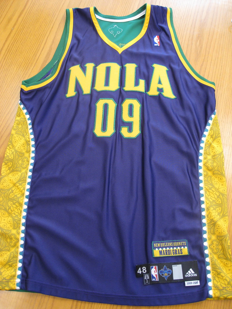
- The only element that really works is the use of "NOLA" as the city name. NOLA refers to the colloquial term for New Orleans, Louisiana and is also the nickname of the Hornet mascot - that's cute. But after that, it goes downhill fast.
- The font for NOLA and the numbers similar to what the Hornets are using for their other questionable jerseys. However it's much thicker and looks oversized and almost child-like. The yellow colour and green outline makes the NOLA script stand out even more.
- The colours of Mardi Gras are green, purple and yellow. Green means faith, purple means justice and yellow means power. Naturally, the designers abused their power by using all three colours liberally including making the jersey two-tone: purple in the front, green in the back. The last two-tone jerseys that went into production were last season's All-Star style, also from New Orleans (quel surprise). It received less than favorable reviews at the time, so I'm not sure why Adidas went back to an unpopular style. The result is a jarring sight because you're not sure which colour to focus on - perhaps they thought it would confuse the competition.
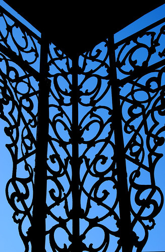
- The side panels add to the busyness of the uniform. The piping resembles Mardi Gras beads and goes the length of the jersey and the shorts in a curve. The gold panels within the beads pay homage to all the beautiful grill work in the city and is only visible up close or in sparkling high-definition. It's colour, texture, shine and pattern - all things that make an outfit interesting, but in overload!
- This uniform features an excessive amount of logos. The fleur-de-lis is on the back of the jersey, the NOLA Hornet on the front of the shorts and the NOLA logo on the bum of the shorts. Finally, there's a "New Orleans Hornets, Mardi Gras" patch above the usual tag on the bottom right of the jersey complete with bead detail. Because, if you didn't already know what the jerseys represented....geeze.
The most tragic thing about this new jersey, is that is simply another awful offering in the Hornets equipment closet. Since the organization's start, from the Charlotte Hornets and even dating back to the New Orleans Jazz, they have not had one respectful, simple uniform. Yes, the city is vibrant and colourful but that doesn't equal over-design.

Take a look at the New Orleans Saints uniforms. A simple fleur-de-lis, clean lines and three colours - gold, black and white. It's an effective and regal look on the field that translates well to merchandise and fans of all sizes.


The Hornets use 4 colours on their home and away jerseys alone: creole blue, purple, white, gold AND stripes. They've changed the shades of the colours so often it looks like someone had an issue with the laundry. Seeing poor NOLA, the teal hornet mascot, in the new jersey is painful. The Mardi Gras colours completely clash with the regular Hornets colours - even the purples are not the same. It leaves that poor hornet looking like a hot mess. The current Hornets jerseys feel dated because the style was big in the early 90's with the Orlando Magic and Toronto Raptors, and those jerseys retired for a reason. I'd classify them in the "so bad they're good" category.
What do you think of the Mardi Gras theme jerseys? Too literal or just right for New Orleans? Would you wear them? And where do you think they rank among the worst NBA jerseys of all time? Leave me a comment or tweet me.
High fives & booty taps,
Megan
PS. I'm also contributing to one of the most dedicated and hardcore NBA blogs around, The Score's Nothing Easy. Be sure to check it out for original content.